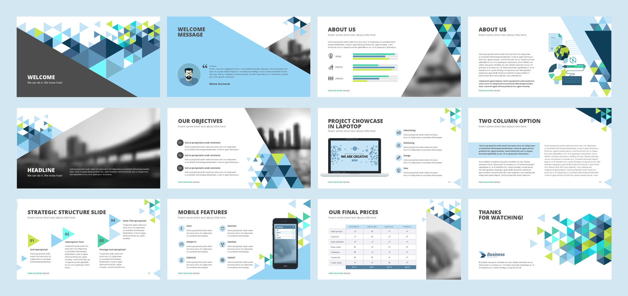
I’ve been quoted by students and clients as saying I hate PowerPoint. That’s not true. I hate BAD PowerPoint. Which is, sadly, almost the same thing since it’s rare that I see slides and visuals that are effective, or even necessary.
In the last month I’ve worked with clients that had restrictions they had to face with PowerPoint that required a different solution than just “create better slides”. While we teach how to create and use PowerPoint effectively, we are often forced to consume others’ creations or use slides for a purpose that makes speech coaches cringe.
First, what do you do when you’re speaking for a conference or organization that has a template that is poor? I worked with a conference template where 25% of the vertical space of a slide was taken up by the header and footer and the background interfered with the readability of the slide. Since slides are usually 16×9, vertical space is at a premium. The template was “required”, but it was forcing a bad experience for the audience.
If the template is bad, you have a few options. First decide if it’s worth fighting. If you are going to be fired for using a different template, I would not recommend resisting the establishment. But you can also make minor changes to a template that may even go unnoticed. In the conference presentation above, we made the footer height about half what was suggested, moved the title up, and were able to redeem about 50% of the “wasted” space for the presentation content. The colors stayed the same; the branding was still on point; and few people likely noticed. Learning to manage slide templates and customizations is a key skill to consuming others’ mandates.
The second problem I recently faced is with presenting slides that are heavy with material. While we fight against this, this is sometimes required. In the presentation above, a client was presenting from a pitch deck where the slides had to be sent in advance and no other materials were allowed. The deck WAS the handout. There needed to be information for the pitch reviewers to consult long after the presentation was complete. Most often a proposal or concept note can accompany the slides. Adding to the problem, the presentation was limited in time and there was simply no way all the material could be read, much less highlighted or covered in detail.
If your slides have to carry information beyond what you will verbally present, then so be it. But you are NOT obligated to cover every point or fact on the slide. In this situation, your presentation priority is telling people how to interpret your slides, not just presenting the information on the slides. We coach three steps to this:
- Introduction: Tell the audience what they are seeing. This SHOULD be the title, but it could be as simple as saying, “This diagram shows our approach to maximizing investor input to our project.”
- Interpretation: Describe the slide and tell them how to read it. Phrases like “Each column represents a phase of the project” or “The blue arrows require feedback from the hiring agency…”
- Importance: Make sure you highlight the key message. Give them the one thing they are to remember. “As you process this information, remember…” or “The one thing to take away here is…”
In an ideal world, we’d devote multiple slides to each point, but that is often not possible. Our third challenge highlights why.
The third problem with bad PowerPoint is when you are told how many slides you can use and what will be on them. This makes my eyes roll because the “rules” are essentially asking for a bad presentation. It could be “Hey, you’ve got two slides and five minutes in the annual meeting,” or in the case of a recent client pitching against other competitors: “The presentation will be 25 slides: one title slide, 14 for the technical approach, four for how you will evaluate success, three for your management team and staffing, and three for your institutional capacity.” They might further restrict building slides (animations) or any text in the notes section. I’d love to tell the requesting body that this is begging for bad presentations and making their job tougher, but they haven’t asked for my advice.
The solution here is to again comply – when rules are handed out this specifically, you can be assured that compliance will be used as part of the “grade” for evaluation of the presentation. But within those restrictions, highlight the things you want the audience to remember and give them reason to ask you the questions you want to be asked.
While slides can be a very effective addition to a presentation, always remember that YOU are the presentation. AI hasn’t been able to replace a live presenter and I don’t think it will. Make sure you deliver the compelling message well. Slides are just a tool to help you in your job.
Communication Matters. What are you saying?
Want more speaking tips? Check out our Free Resources page and our YouTube channel.
We can also help you with your communication and speaking skills with our Workshops or Personal Coaching.
This article was published in the October edition of our monthly speaking tips email newsletter, Communication Matters. Have speaking tips like these delivered straight to your inbox every month. Sign up today to receive our newsletter and receive our FREE eBook, “Twelve Tips that will Save You from Making a Bad Presentation.” You can unsubscribe at any time.


